building a two-week website with staying power
After delivering a refreshed web experience in record time, we set out to retool its engine and deliver a site with staying power.
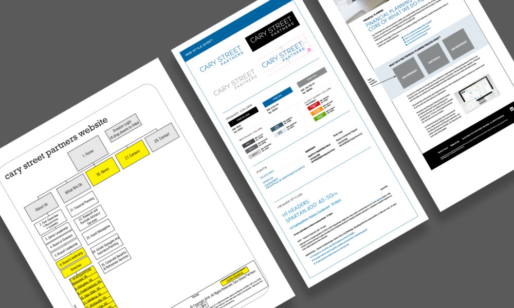
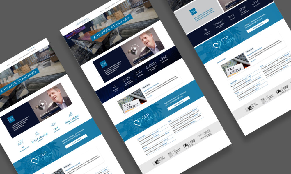
Cary Street Partners is a national wealth management firm specializing in financial planning, asset management and retirement services. They initially came to us with an impossible request: redesign two of their websites in two weeks. To take on this impossible challenge, we’d have to make compromises to meet the deadline. One of those was keeping the ultra-complicated technical structure of the site and instead focusing on updating the client-facing content.


Our Solution
We did it! But then immediately set about creating a site where the backend was as beautiful as the front. With the refreshed sites in place, we built again from scratch. Not only did we erase the complicated technical structure—we added intelligent controls that made updating the site nearly bullet-proof.
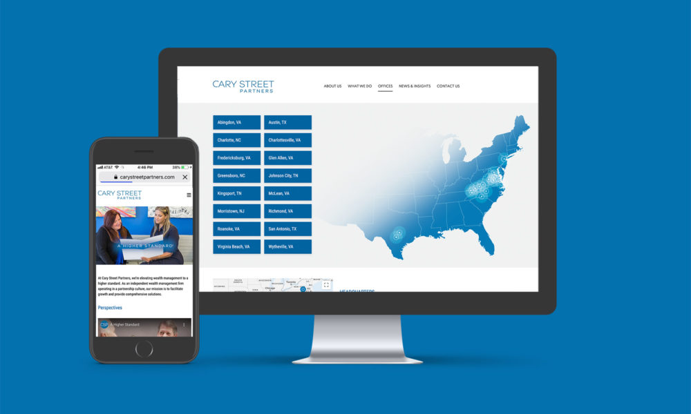
The new combined website not only displays the content well, but it incorporates technology to enhance the user interface and ease content management. A custom location map, smart employee profiles, video gallery, podcast hub, job postings, and interactive timeline bring to life otherwise mundane content.


The Result
Yes, the new site looks better. But more importantly, it functions much better. Page speeds are faster, information is more easily accessible, and important messages are presented in an engaging and interactive fashion, enhancing customer engagement and deepening relationships.
Today, we continually update the site with smart functionality and fresh content. New additions include a super sleek and informational “Insights” page that acts as a blog with the most up-to-date financial data and commentary. To highlight Cary Street Partners’ philanthropic initiatives, a landing page for CSP Cares was launched—complete with a logo carousel, custom icons, and news feed— highlighting how Cary Street Partners is inspiring their employees and the communities they live in.
Most firms would have said no. 93 Octane found a way do it in record time. And then gave me an elegant, long-term solution to boot.
— Kara Valentine, Marketing Director
see more
